In the IICRD logo a young person and adult are walking together, with the young person taking the lead.
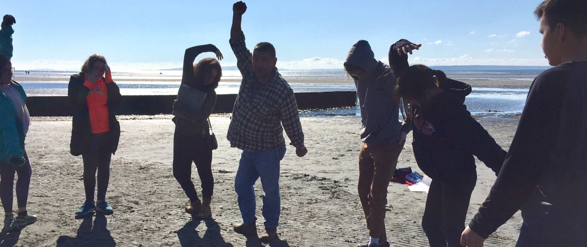
They walk together, to highlight the importance of intergenerational collaboration across an atmospheric landscape that highlights our work locally, nationally, and internationally. The weaving lines emphasize the interconnected and interdisciplinary nature of our work in relationship with young people, families, communities, and across disciplines and sectors. The golden hue of the sky symbolizes the warmth and strength inherent in our relationships with one another, while the blue and green of the land symbolize the importance of our relationship with the natural world.
This logo was created in 2020 by Pablo Munoz, in collaboration with our team, Board, partners and with feedback from young people themselves.
This visual identity evolves from our original logo designed and gifted to IICRD from a Coast Salish woman, Rita George Greene. Our holistic integrated approach to issues affecting children is reflected in our logo:Two thunderbirds in flight, protecting male and female ancestral figures.
- The Yellow Sunshine at the Centre represent Songs and Prayers. The top red figure is a stylized female figure taken from a pre-contact Coast Salish Box drum.
- The red represents the femine, healing and balance while black supports her thought and speaking processes. She carries both colours to ensure the sacred balance of male and female energy and helps to maintain balance with her traditions, ancestors, the Creator and the community.
- The bottom Black Figure is a stylized Male Figure, also taken from a pre-contact Coast Salish Box Drum. The black signifies male energy with red across his forehead and mouth to ensure that his thinking and speaking functions carry both male and female entities. Both of these colours/sacred energies are applied to ensure that any ritual activities he undertakes is in balance with the ancestors, the creator and his community.
- The white markings represent purity and innocence and are applied to the male figure to soften his great strength.
- The blue outer circle represents the Creators gifts’ associated with the sky: the morning sun, the birds and supernatural beings. The outer green circle represents the creators’ gifts associated with the home of all animals and places where sacred spots, places of power have been made available.
- The Red Thunderbird speaks to ritual ceremonies associated with transformation and change. It is during these periods of change that the old people speak about being prepared and being ready to move as a community. The red thunderbird honours natural and supernatural beings associated with healing and female energy (both physical and spriritual). The red thunderbird, sacred to many First Nations, also carries energies associated with black and the power of men and purity.
- The Black Thunderbird speaks to change and is accelerated by the old people's knowledge of songs and ceremonies, to protect the weak, vulnerable and the community. It honours natural and supernatural beings associated with strength and male energy (both physical and spiritual). As with all sacred ceremonies/entities/teachings, the black thunderbird is softened with the colours of red and white.
These Indigenous teachings on individual and community protection and well being have informed our approach to working in diverse socio-cultural contexts by "balancing the best of both worlds", bringing children's lived experience and the best of our shared human resilience to meet and manage global and local adversity.